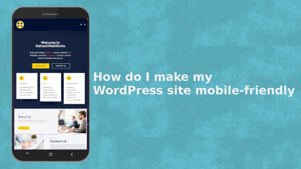
In today’s digital landscape, having a mobile-friendly WordPress site is no longer optional—it’s essential. With over half of all web traffic coming from mobile devices, ensuring your site looks and performs well on smartphones and tablets is critical for user experience and SEO.
This guide will walk you through the best practices to optimize your WordPress site for mobile, including leveraging a WordPress child theme for safe customization.
Table of Contents
Why a Mobile-Friendly WordPress Site Matters
Google prioritizes mobile-friendly websites in search rankings. If your site isn’t optimized for mobile, you risk:
- Higher bounce rates – Users leave if your site is hard to navigate.
- Lower search rankings – Google penalizes non-mobile-friendly sites.
- Lost conversions – Poor mobile UX leads to fewer sales or leads.
Let’s explore how to make your WordPress site fully responsive.
1. Choose a Mobile-Responsive WordPress Theme
The foundation of a mobile-friendly site starts with your theme. Many modern WordPress themes are built with responsiveness in mind.
How to Check if Your Theme is Mobile-Friendly
- Use Google’s Mobile-Friendly Test.
- Preview your site on different devices using browser developer tools (F12 > Toggle Device Toolbar).
If your theme isn’t responsive, consider switching to one that is, such as:
2. Use a WordPress Child Theme for Customizations
If you’re making design changes to improve mobile responsiveness, always use a WordPress child theme.
What is a WordPress Child Theme?
A WordPress child theme inherits functionality from a parent theme while allowing safe modifications without losing updates.
Benefits of Using a Child Theme
- Preserves changes when the parent theme updates.
- Reduces risk of breaking your site.
- Allows custom CSS and template tweaks for better mobile UX.
How to Create a WordPress Child Theme
- Install a child theme plugin (e.g., Child Theme Configurator) or create one manually.
- Add a
style.cssfile with the required header. - Enqueue parent and child theme styles in
functions.php.
3. Optimize Images for Mobile
Large images slow down mobile load times. Optimize them by:
- Using WordPress plugins like Smush or ShortPixel.
- Serving WebP images for better compression.
- Setting correct image dimensions with
srcsetfor responsive loading.
4. Implement Responsive Design with CSS
Custom CSS ensures elements adapt to different screen sizes.
Key CSS Techniques for Mobile
- Media Queries – Adjust styles based on screen width.cssCopy@media (max-width: 768px) { .header { padding: 10px; } }
- Flexible Grids – Use
%orvwinstead of fixed pixels. - Touch-Friendly Buttons – Ensure buttons are at least 48x48px for easy tapping.
5. Improve Navigation for Mobile Users
Mobile screens require simplified navigation.
Best Practices for Mobile Menus
- Use a hamburger menu for compact navigation.
- Implement sticky menus for easy access.
- Avoid dropdowns that are hard to tap.
Plugins like WP Mobile Menu can help streamline navigation.
6. Accelerate Mobile Page Speed
Slow-loading sites frustrate mobile users. Speed up your WordPress site by:
- Enabling caching (WP Rocket, W3 Total Cache).
- Minifying CSS and JavaScript (Autoptimize).
- Using a Content Delivery Network (CDN) like Cloudflare.
7. Test Your WordPress Site on Multiple Devices
Before finalizing changes, test your site on:
- Real smartphones and tablets.
- Browser emulators (Chrome DevTools).
- Online tools like BrowserStack.
Conclusion
Making your WordPress site mobile-friendly is crucial for SEO and user satisfaction. Start with a responsive theme, use a WordPress child theme for safe customizations, optimize media, and streamline navigation.
By following these steps, you’ll ensure your site delivers a seamless experience across all devices—boosting engagement and rankings.