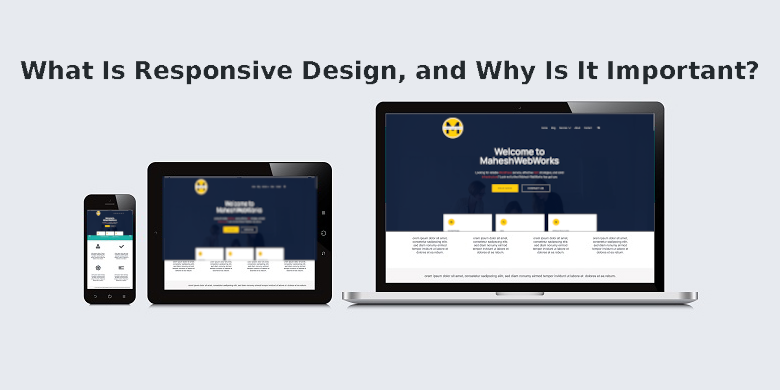
Table of Contents
Introduction to Responsive Design
In today’s digital world, users access websites from various devices—smartphones, tablets, laptops, and desktops. Responsive design ensures your site looks and functions perfectly across all screen sizes. For WordPress users, implementing responsive design is crucial for delivering a seamless user experience.
This article explores what responsive design is, why it matters, and how WordPress and WordPress child themes play a key role in creating mobile-friendly websites.
What Is Responsive Design?
Responsive design is a web development approach that allows a website to automatically adjust its layout, images, and content based on the user’s device. Instead of creating separate sites for desktop and mobile, responsive design uses flexible grids, CSS media queries, and scalable elements to ensure optimal viewing.
Key Features of Responsive Design
- Fluid Grids: Layouts resize proportionally.
- Flexible Images: Media scales without distortion.
- Media Queries: CSS adapts to different screen sizes.
For WordPress sites, themes and plugins often include built-in responsive features, making it easier to maintain consistency across devices.
Why Is Responsive Design Important?
1. Improved User Experience (UX)
A responsive site ensures visitors have a smooth experience, whether they’re on a phone or desktop. Poor mobile usability leads to higher bounce rates.
2. Better SEO Performance
Google prioritizes mobile-friendly websites in search rankings. If your WordPress site isn’t responsive, it may rank lower, reducing visibility.
3. Increased Mobile Traffic
Over 50% of web traffic comes from mobile devices. A responsive design captures this audience effectively.
4. Easier Website Management
Managing one responsive site is simpler than maintaining separate desktop and mobile versions. WordPress child themes help customize responsive layouts without breaking the parent theme.
5. Higher Conversion Rates
A well-optimized responsive design improves engagement, leading to more leads and sales.
How WordPress Supports Responsive Design
WordPress is a powerful platform for building responsive websites. Here’s how:
1. Responsive WordPress Themes
Most modern WordPress themes are mobile-ready. Popular themes like Astra, GeneratePress, and OceanWP include built-in responsiveness.
2. WordPress Child Themes for Customization
A WordPress child theme lets you modify a parent theme without losing responsiveness. You can tweak CSS, layouts, and functionality while keeping mobile compatibility intact.
3. Plugins for Enhanced Responsiveness
Plugins like WP Touch and Elementor help optimize mobile viewing. They ensure your WordPress site remains fast and adaptable.
Best Practices for Responsive Design in WordPress
1. Choose a Mobile-Friendly Theme
Always select a WordPress theme labeled “responsive” or “mobile-optimized.”
2. Use a WordPress Child Theme for Safe Customizations
Editing a WordPress child theme prevents losing changes during updates while maintaining responsiveness.
3. Optimize Images and Media
Compress images and use lazy loading to improve mobile performance.
4. Test Across Devices
Use tools like Google’s Mobile-Friendly Test to check responsiveness.
5. Prioritize Speed
A slow site hurts UX. Use caching plugins (like WP Rocket) and optimize code.
Conclusion: Responsive Design is a Must for WordPress Sites
Responsive design is no longer optional—it’s essential for SEO, user experience, and business growth. WordPress makes it easy with responsive themes, WordPress child themes, and plugins.
By following best practices, you ensure your site performs well on all devices, keeping visitors engaged and improving search rankings.